The second room reveals for the elimination series scored high and were much better than the first reveals. Thank goodness for some new and fun ideas!
Josh and Charlotte
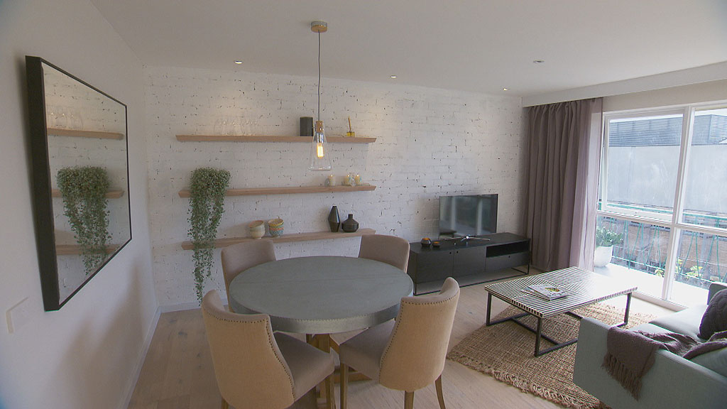
Design Feature: Exposed Brick Wall
Josh and Charlotte continued their own subtle scheme exposing and painting a single brick wall in the living/dining room to add some wonderful texture. Everyone gasped when the bricks revealed an unsightly mustard colouring, which is not so uber cool, however once painted white, it eluded to a textural pattern which fitted right into their design.
Pulling it together
Choosing the same flooring throughout the bedrooms and living/dining really links the spaces together and creates a lovely flow on effect. This is great for small homes or for linking smaller open plan living spaces. This is quite a common problem for small volume build homes in the current estates.
Small open plan living, dining and kitchen spaces do well with continual flooring instead of selecting multiple types of flooring which inevitably breaks up the floor space into tiny areas.
The colour scheme has subtle tones of Lilac, blue, natural linen, white washed timber with some darker elements for interest and depth.
Luke and Ebony
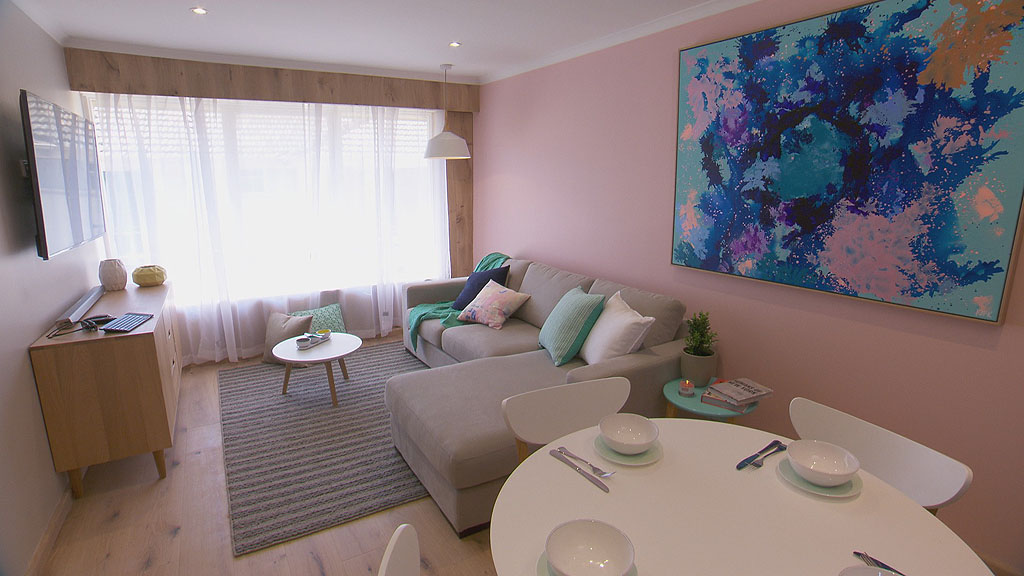
Design Feature: Balanced Colour Scheme
Once again, Luke and Ebony have struck gold with their bold colour choices by matching the artwork to their decor. Peach, pink, coral or whatever you fancy calling it, was a hit however, it does leave this room feeling more feminine. This is because it is also matched with other dainty colours of the light sea mist greens, some grey and blues plus touches of white to break it up.
Masculinity can be pink, but it needs very different items and coordinating colours.
Pulling it together
They have used very well coordinating features such as matching the grey wall (opposite the peach) to the grey sofa.The timber feature wall at the window also reflects the sideboard and flooring plus the table legs are also in keep. The dining table looks a little bare. Maybe a simple centre piece needed here with placemats, glasses, but overall very light and fresh.
Jess and Ayden
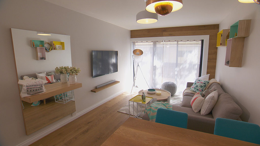
Design Feature: Floating storage
This design ingeniously uses shadow boxes, a floating tv shelf (for a speaker I think) and a floating shelf/draw unit. Having them very shallow also means they take up less space as they jut out into the room, meaning less bumps by legs and hips.
Floating storage is a wonderful way to increase a tiny floor
space.
Shadow boxes are very cool right now, but be very careful and shop around. Some are $15 and for the same design you can spend $350! Check out my previous post here on these great discounts!
Pulling it together
Once again, the use of colour is great here and this works because all the colours are the same tone. (one is not dramatically darker or lighter than the other nor brighter or more dull.) These colours are set into a background of light grey and timber which is a nice and modern neutral background. That means whoever buys the unit can still dress it up to their liking and not have to stick with the brighter colour choices. Special mention to the tall mirror here. Not only does it increase the height of the room but it also helps bounce any available light throughout the space.
Tim and Anastasia
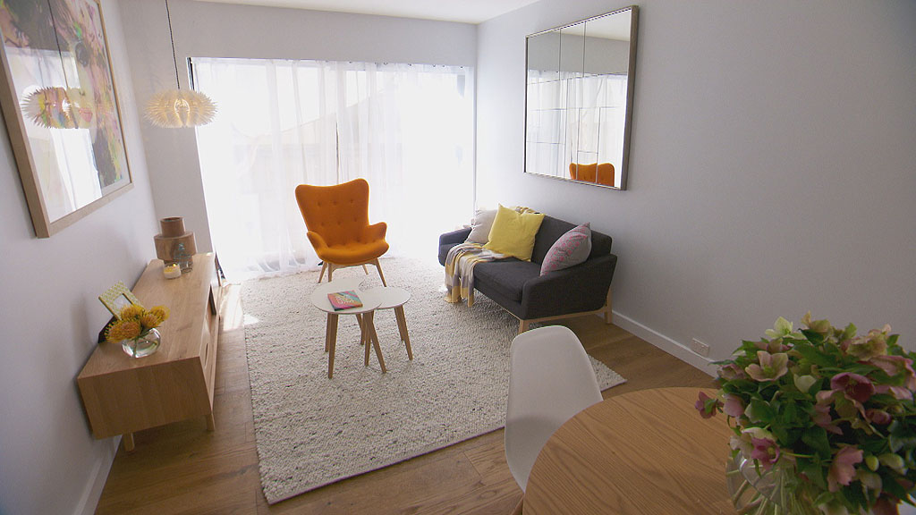
Design Feature: If all else fails, choose great artwork?
The best part of this room is the artwork. It’s large and beautiful and full of colour. Some people are scared to use large pieces of artwork because they end up dictating the atmosphere and the colours in a room. As long as you are careful with your selection, a large artwork can be the feature and not take over the whole design.
Pulling it together: Or not.
I really dislike this design. I feel it is too much of a cliche and there is no individual style evolving from Tim and Anastasia here. There’s no TV, the couch is too small, the furniture is too retro/vintage and outdated and the coffee table is pretty useless. You cannot just pick some random designer furniture and expect to come up with something awesome. How to fix this? Ask yourself how do you want to relax after being at work all day. Normally, that’s a good start for inspiration. DO you want to snuggle, slouch or sit upright. I’m sure you’ll agree that it doesn’t include the girlfriend crossing her legs in the chair and the boyfriend throwing his long legs over the arm of the sofa to watch an artwork. Wait, I think it’s eyes are following me!
Brooke and Aimee
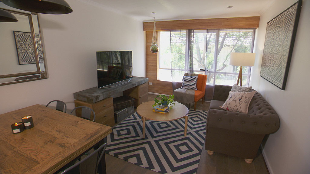
Design Feature: Industrial chairs with rustic table
This is probably the best furniture in the room. Industrial chairs look awesome teamed with a beautiful rustic timber dining table. The timber has dark feature grain and black legs with a basic farmhouse patterned top. The grey industrial Tolix chairs are a great combination.
Pulling it together
For a small room, all the deep set furniture make it too crowded. It’s a bit of a mix up with trying to match the furniture to something cohesive. The rug is fantastic but the blond coffee table is a loss. The sofa is too small and the new retro chair doesn’t fit in the theme. Change the entertainment unit, coffee table and chair and they might have had a better chance of pulling it together. Oh, I just spotted the macrame. No, no no. Not here ladies.
Well that wraps up the second elimination reveal for the Blockies. Is there one more left? I think Tim and Anastasia might be next. It will leave the most unique designers left, don’t you think? If you missed it, check out my week 1 reveals here.