Wow, what a whirlwind of results! A total backlash on social media for the winners of the Triple Threat, Deanne and Darren, followed by an outpouring of love and admiration for the two pairs who sadly didn’t make it through, Matt and Kim, Bec and George. I felt the latter couples really showed brilliant design, innovation and creativity much more than the “winners” and it seems Australia, being of fair people, cannot justify the result based on the performance and attitude of Deanne and Darren from last season. I think this is mainly because Australian’s love the story of the underdog getting the gold and detest bad sportsmanship. It will be interesting going forward how relationships form on The Block and how they relate to each other as the times get tough.
Lets break down the rooms.
Matt and Kim
Style Kudos : Feminine
Matt and Kim actually really surprised me with their room being so opulent and different to their previous style. Whenever I see this sequence of feature panels coupled with brass and marble, it takes me back to France and visiting Versailles. The best thing about panelling (in various forms and styles) is that it’s dirt cheap to make but creates a really expensive atmosphere!
Pulling it together
A beautiful colour pallete of white, soft greys and taupe, brass, black and highlights of pink tie in beautifully together. Every colour is well balanced, neither is too much or too little. Don’t like the pink? You can certainly change the pink to say, white or black or even more of that emerald green for a more masculine room. Did you see the different patterns used to complete the room? A little bit of stripe cushion, crosses, geometric Moroccan rug and floorboards on the angle all add touches of sophistication and they are all quite subtle.
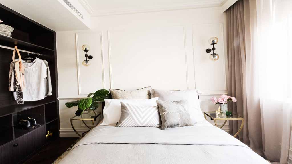
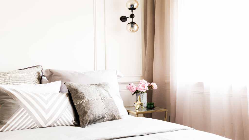
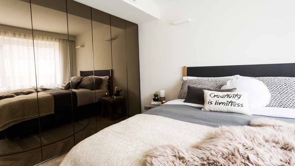
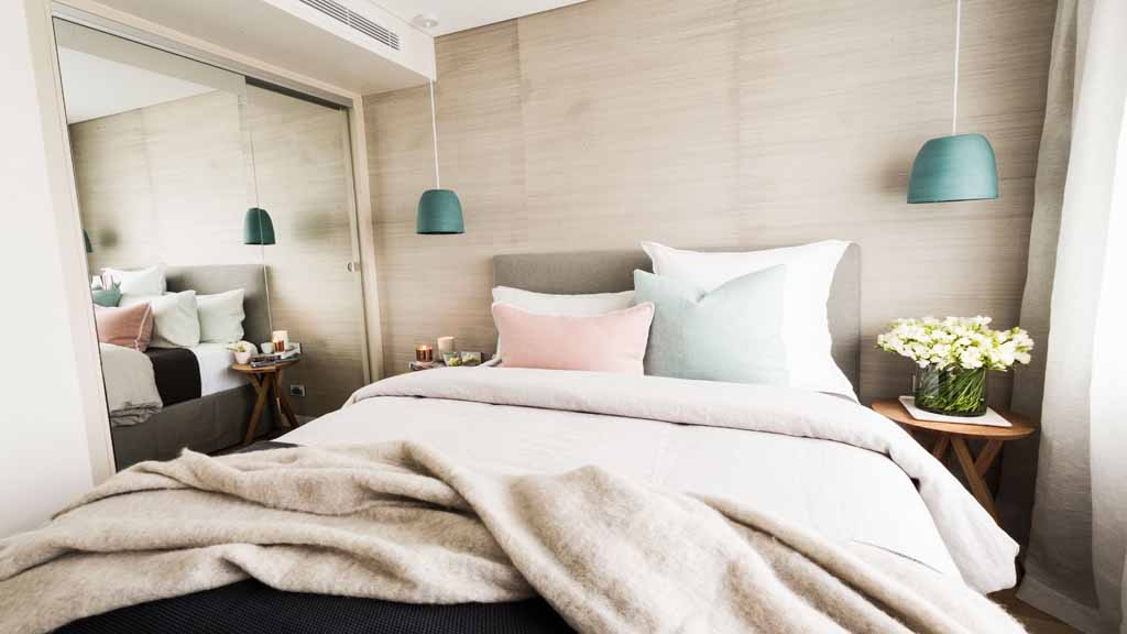
Bec and George
Style Kudos : Texture
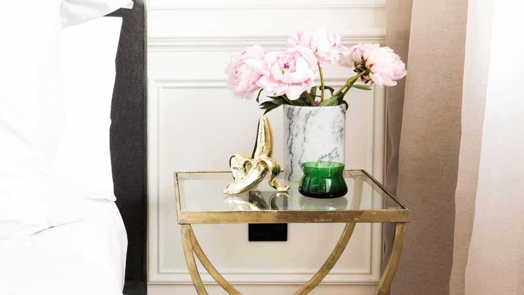
What can I say? It just feels fresh and new to me. I haven’t seen this style before. It’s really welcoming, warm and relaxing and also very intriguing. The gold planter is amazing, the side table is beautifully different and the bed linen is so delicious I want to curl up in it with a good book or a naked husband. Bec and George have nicely layered different textures to create interest with soft fur (hope it’s faux), knitted cushions and blankets, a soft rug atop the amazing French oak floorboards, sheer curtains,a concrete and timber side table and lastly, the glossy wardrobe cabinets. Just amazing!
Pulling it together
A colour palette of timber, black/charcoal, grey and light brown creates a very earthy and natural feel. We are just starting to see concrete furniture and concrete lookalike pieces come through retail stores for our Australian homes and it will become much bigger throughout the year. Chain stores like Kmart are playing with small items like small concrete pot plants and lettering. A room deserving of a win but there could only be one…one room to rule them all. I seriously couldn’t pick between Bec and George and Matt and Kim.
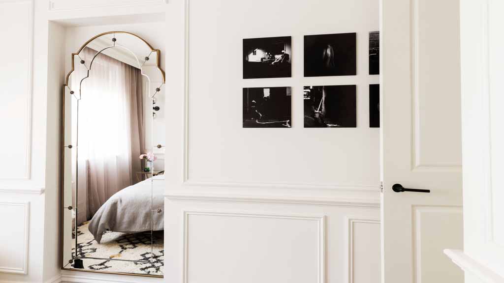
Daz and Dea – They won their place on The Block
Style Kudos : Sea grass wallpaper
Sea grass wallpaper was being used a lot about 5-8 years ago however, it is coming back for a second round and I’m happy with that. This is mainly due to it being a great, cheap-ish way to add texture and warmth to a plain plastered wall. We all have way too many plain walls in our homes!
Pulling it together
Another soft palette of brown, grey, timber and charcoal with highlights of pink, white and blue. Overall, a nice room and quite comforting but it’s not really pushing the design envelope. A good amount of texture with nothing too out of place except a sense of entitlement and narcissism. Wink!

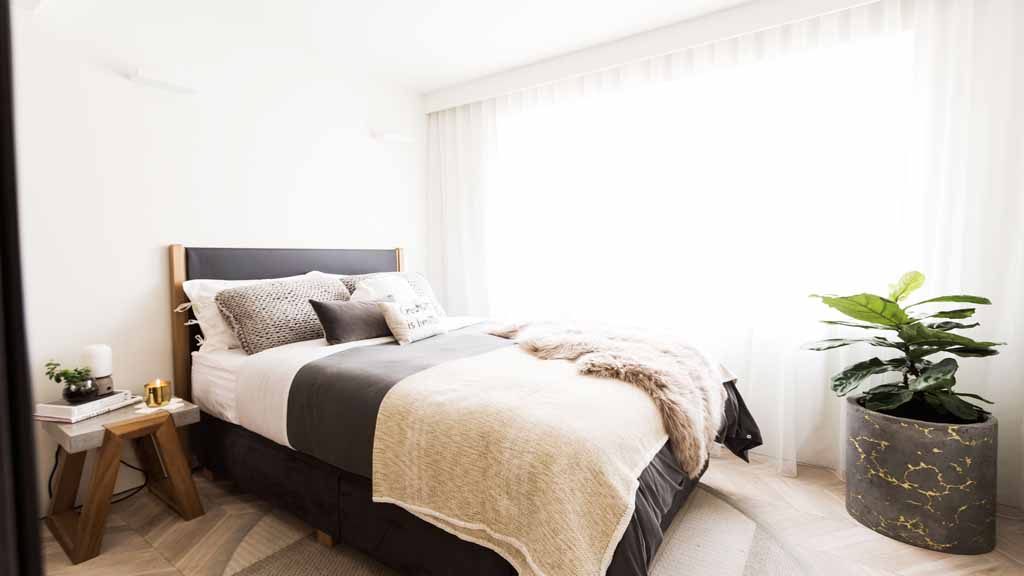
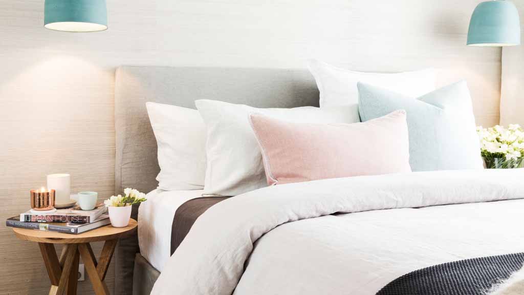
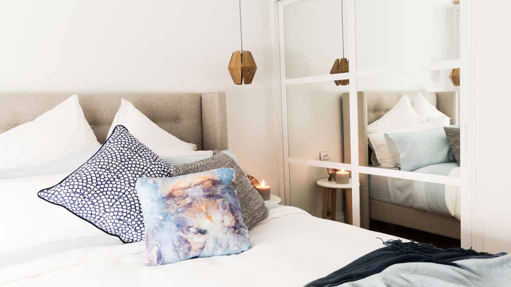
Jess and Ayden’s winning room
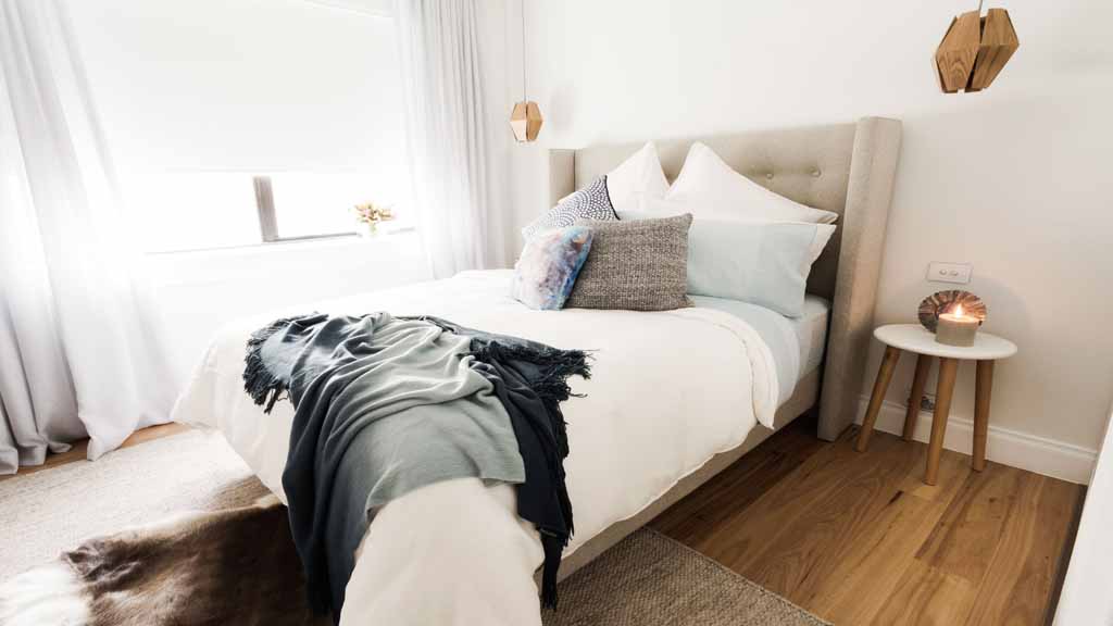
Style Kudos : Messy Cushions
This may seem funny to comment on however, you can see from this shot how styling the cushions messy like this along with the thrown throw actually adds to the effect of the understated or lived-in feeling. This is important because sometimes you don’t want perfectly primped cushions and pillows and square layered throws. At home, how many throws and blankets do you layer on? Seriously. I have one blanket and I normally toss my pillows on like this because I have better things to worry about! By doing this, it creates a sense of reality, unity, family and you can say, hey, this feels like ‘my bed’. And that’s nostalgic and nice. It’s not a hotel, it’s my bed.
Pulling it together
For the 3rd time now, a neutral, warm colour palette. So, you have picked this is on trend right? Good. The only difference here is they have added some navy blues. I love an upholstered bedhead, especially one with buttons and wings.

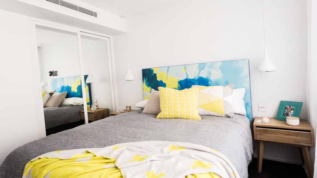
Tim and Anastasia
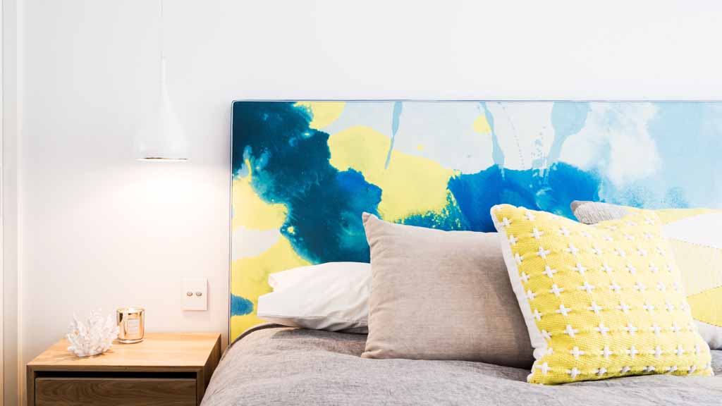
Style Kudos : Colour Pop bedhead
Very different and very bold is this strikingly colourful bedhead. A good mix of blue and yellow makes gives a very happy kind of feeling. The only bad thing about this is that all the bedding the cushions have to match this for a good 10 years! That would kill me! I think it may be better suited to a beach side hotel room where you only stay for a few days.
Pulling it together
I’m not so sure where Tim and Anastasia are going with their style. They seem to have something different every week and from what it looks like on next weeks reveal, they might be in hot water for copying someone else! Finding your own style is definately a journey and you cannot force it. It comes naturally. It’s best if you choose items that you like and find ways of fitting them together without copying a entire catalogue page. It’s about being brave and honest about what you like. That’s making design personal.
Colourwise, yellow will always pop from grey and it’s a great combination to uplift any grey neutral space. You can even play with different tones of grey like charcoals and offset with crisp white. Yellow, mustard or fluro will all work with this kind of scheme, always.
Josh and Charlotte
Style Kudos : They broke it. What have they done?!
Oh no. What happened? I need to desperately fix this room. It’s slightly out of character for them is’t it? We were expecting another suave slightly Scandinavian room full of texture but they seem to have become a little lost. The bold retro prints, the blue Moroccan rug, the stainless table lamp and the weird black and glitter side table have got to go. They make my eyes hurt. Please replace these things with pretty stuff matching your other rooms.