An explosive 1st room reveal has showcased some new ideas and new talent from the new kids on The Block. Slow to start, the new blockies finished their rooms in time for the reveal but not without some quality issues. Who can blame them with only 24 hours to turn around a bedroom! Short as it was, the designs and colour schemes themselves weren’t too bad. It’s about thinking creatively and quickly. There is only so much you can do with a queen bed and a tiny, narrow room. The best use of space would have to be Luke and Ebony, putting the bed against the window. I’m all about light but I’d rather this than a 400mm shuffle space at the foot of the bed.
The blockies picked some current trends to establish their bedroom designs. Let’s break them down in each room.
Winners: Josh and Charlotte
TREND 1: Timber feature wall
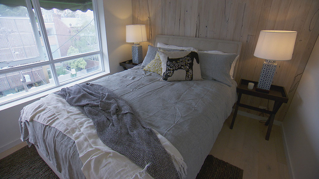
Josh and Charlotte used a beautiful white washed blackwood feature wall with the boards running vertically to increase the height of the room. A very clever idea. It also would have worked in a horizontal pattern to increase the width of the room. Timber in a bedroom creates warmth and is a nice contrast to often stark white or beige wall colour schemes.
Pulling it together
They carefully created depth by using a dark grey floor rug and added softer grey and white layers being the quilt cover and throw rugs. To break up the monotony, they chose darker x-style side tables with tall patterned lamps.
Having lamps slightly higher than the bedhead creates stature and elegance.
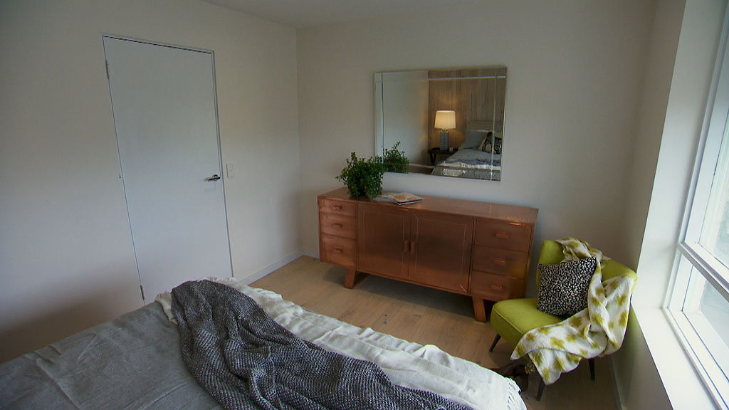
Did you see the copper sideboard they through in? Copper is also on trend but I don’t like how this was styled, a pot plant and some magazines thrown on top. I’m also not a fan of the lime green retro chair. It clashes with the opposite end of the room. Let’s not forget the room has no wardrobe! Whoops! Hanging space definately a requirement for a bedroom and this one had the best floor plan with the largest possible wardrobe space available. Tisk, tisk.
Luke and Ebony
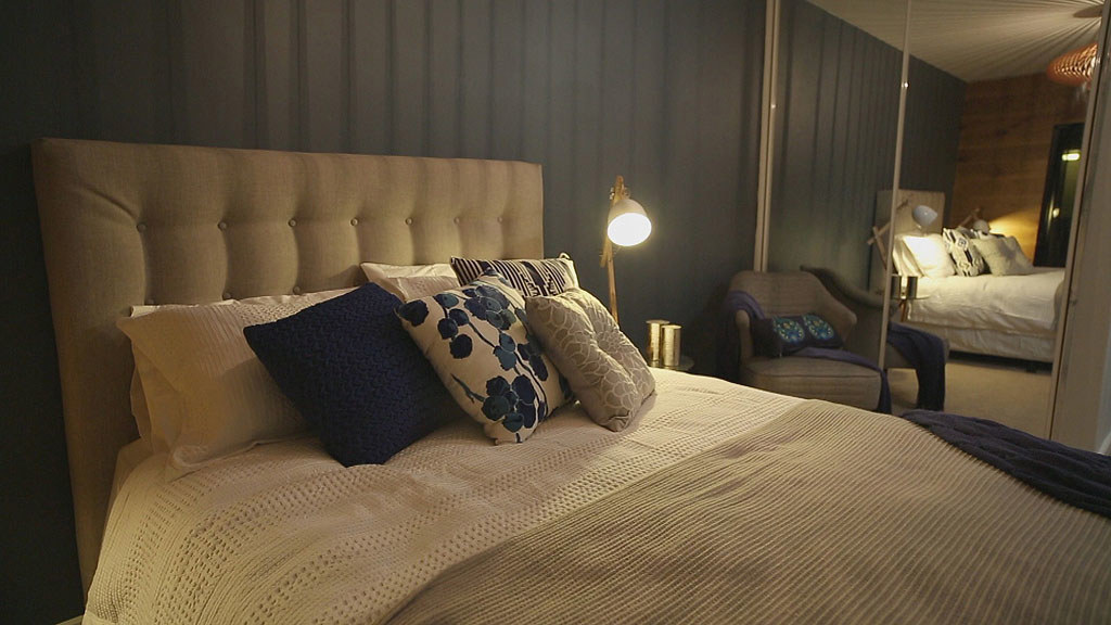
Trend 2 : Blue colour scheme
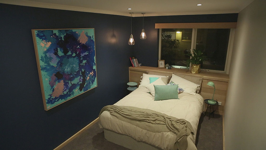
This beautiful scheme of moody dark blue is accentuated with a lighter, pastel blue is totally tempting. Blue is currently on trend and happily mixes with whites for a crisp finish and also metallics. To keep the room from feeling too cold, they cleverly used timber to add warmth, as the bedhead, skirting and artwork frame.
Pulling it together
The asymmetrical design of using one bedside lamp but on the other side, twin hanging pendants, creates immediate interest. The room is also layered with shades of grey, and various shades of blue with the hint of pink and gold. It gives it a very fresh and beachy kind of feel without having to be near the beach.
Jess and Ayden
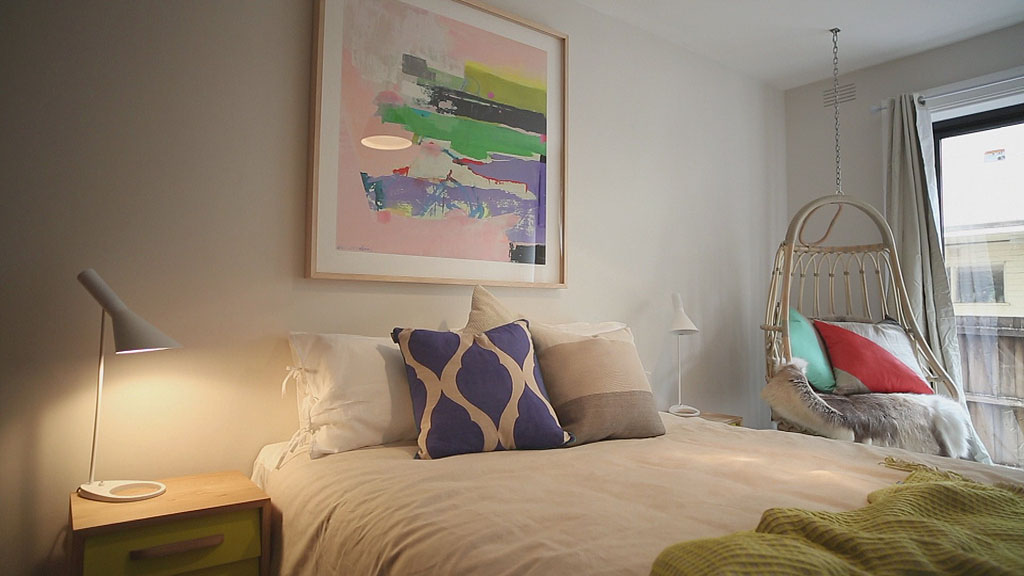
Trend 3: Colour Pop
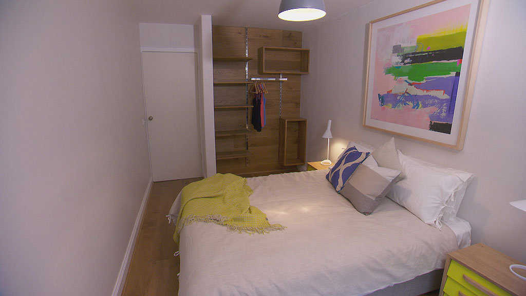
Jess and Ayden smashed colour all over their room and tied all the colours to the artwork. This is a clever way to start a colour scheme. Find a great artwork you love, then use the colours in the artwork around the room in the furniture and decor.
Pulling it together
This works because the colour from the artwork is quietly hinted over a neutral colour scheme of white, grey and timber. Without even thinking about it, your eyes are telling you it works but you can’t figure out why so many colours match in one room. Well, this is why! They have deconstructed the artwork over the entire room.
Clever mention to the open timber wardrobe. I know that it wouldn’t work for me because wardrobes always seem messy. I’d have to style my folded and neatly pressed clothes constantly. Ain’t nobody got time for that!
Brooke and Aimee
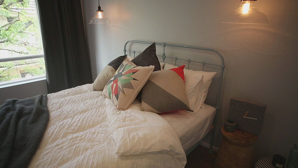
Trend 4 : Iron beds
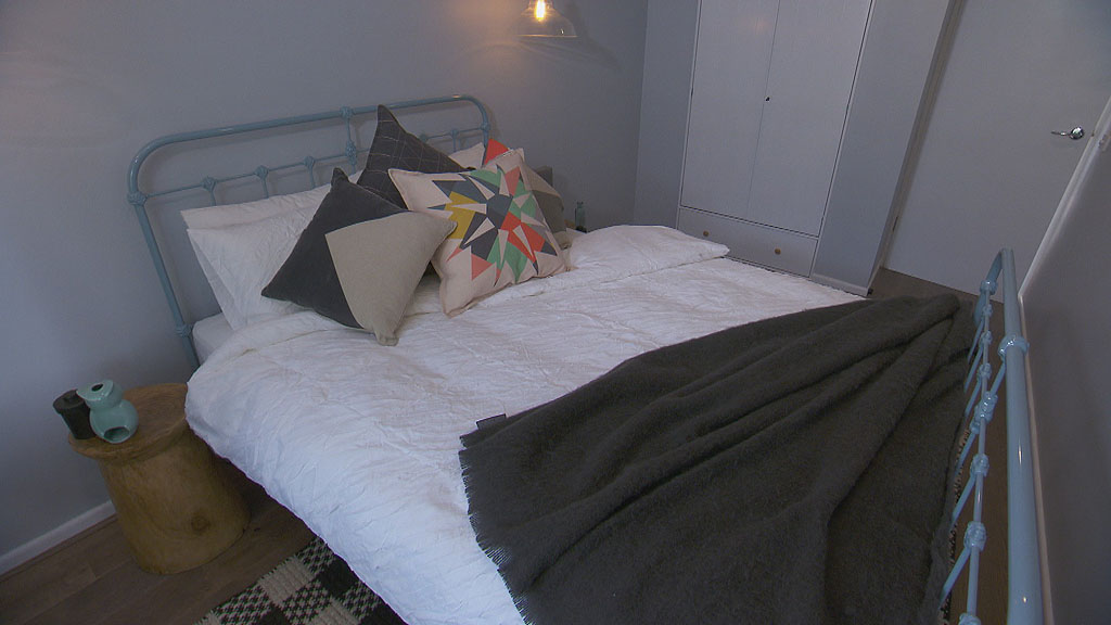
My gosh, iron beds are popping up everywhere. Aren’t they divine in colour! You can now get them in copper plus an array of brights which are very popular for kids rooms right now.
Pulling it together
The colour scheme is a subtle mix of grey, pale blue and hints of orange with a backdrop of warm timber floors and side tables. It’s like Neale said, it’s country meets industrial. Dark greys and black on the curtain, throw and cushions create depth whilst the softer grey and pale blue add layers. A nice mix of textures bring interest and warmth to the room with the spice of orange keeping it energetic. Without the orange, it may feel too plain.
Special mention to the wardrobe inset into the wall. A clever idea. Although, they did almost halve the wardrobe space by doing this. It would have been cheaper, easier and quicker just to build a wardrobe in the ready-to-go space.
Tim and Anastasia
Trend 5 : Feature Pendant lighting creating interesting shadows
A beautiful feature pendant light hangs in the middle of the ceiling, as opposed to the standard down light set of today’s houses. Being an open pendant, it allows a play of light and shadow to create a stripe effect over the ceiling and walls.Although, I have astigmatism. So all these stripes, would send me gaga, rum la la and have me face planting the floor more often than I would like! But, the effect is great.
Putting it together
A great layered blue and natural linen colour scheme once again with a mix of soft textures. Slightly different blues all with the same tone are scattered about in contrast to the linen and white scheme and complemented with warm a warm timber paneled feature wall and an industrial style timber lamp.
Glass top side tables trick your eye into increasing the floor space
They also used a multiple blue coloured artwork to tie in the colour scheme and I love that print!
Mark and JJ
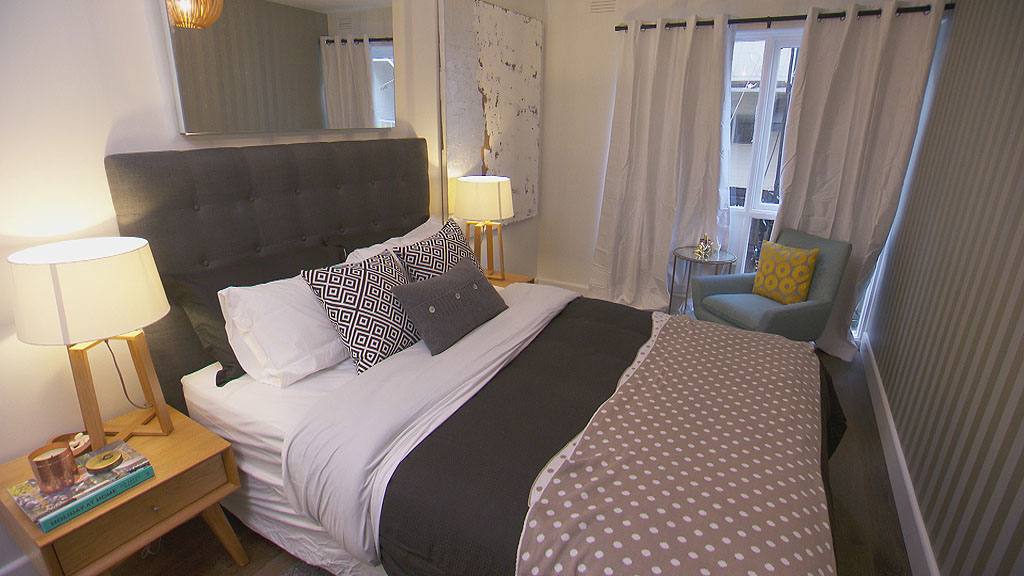
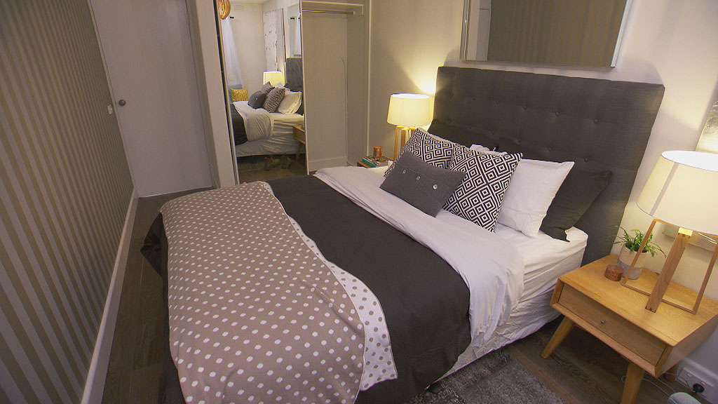
Why they lost- Trend 6 : Err all of them?
That’s right! You have a retro chair with an art deco side table with a retro bedhead and side tables alongside modern industrial spawned lamps with classic striped wallpaper and a plain mirror…ugh. Too much!! I’m out of breath! I call this a bitsa everything room. It seriously needs a theme. You can definately mix different era’s of furniture, but not like this. All these pieces are great…by themselves, but not thrown in together like this.
Credit for keeping a full wardrobe though with mirrored doors. A great way to help bounce light around the room and increase the feeling of space in a tiny area.
