What a wonderful wrap up to the elimination series! Gee, those bathrooms were ridiculously tiny and maximising the layout was paramount. Some were hits and others were misses but all in all, the results were pretty good and the Blockies are getting better every time.
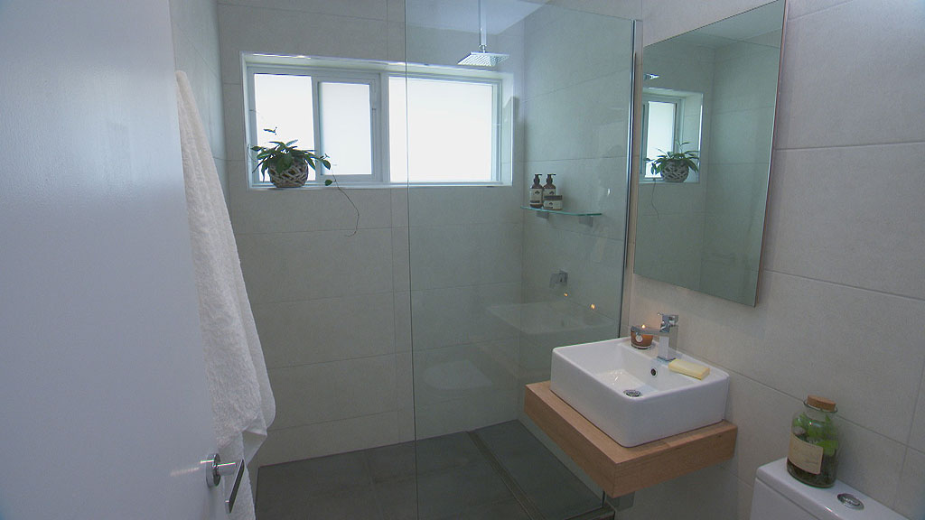
Josh and Charlotte
Space Saver: Custom inset mirror cabinet
This is a great way to increase storage without having a large cabinet jutting out from the wall. Josh and Charlotte cleverly created a custom cabinet, deeper than the average store bought variety I think (about double, at least 250-300mm?) . Mirror cabinets like these are paramount to a bathroom. I have one that is 1500mm wide and it’s full!!
Pulling it together
The bathroom complements the rest of the apartment with it’s soft grey colour scheme with hints of white and timber. Although plants look great, I’m probably never going to have one in my bathroom. A clean, single fixed pane shower screen is a cheap and perfect feature for this tiny room and with the robes appropriately placed. The basin and feature counter are perfectly sized and match in with the other square elements in the room. Large format tiles have been used and this, to some, might seem out of the ordinary, but we have well surpassed the idea that small tiles belong in small bathrooms. It’s not the case! And this is the proof.
Special mention to the power point located inside the cabinet. Great idea to hide away ugly plus from view and to get away from the Australia Standards for water access. Often power points are hard to place because they are too close to taps and water outlets. Putting them in the cabinet is a win win!
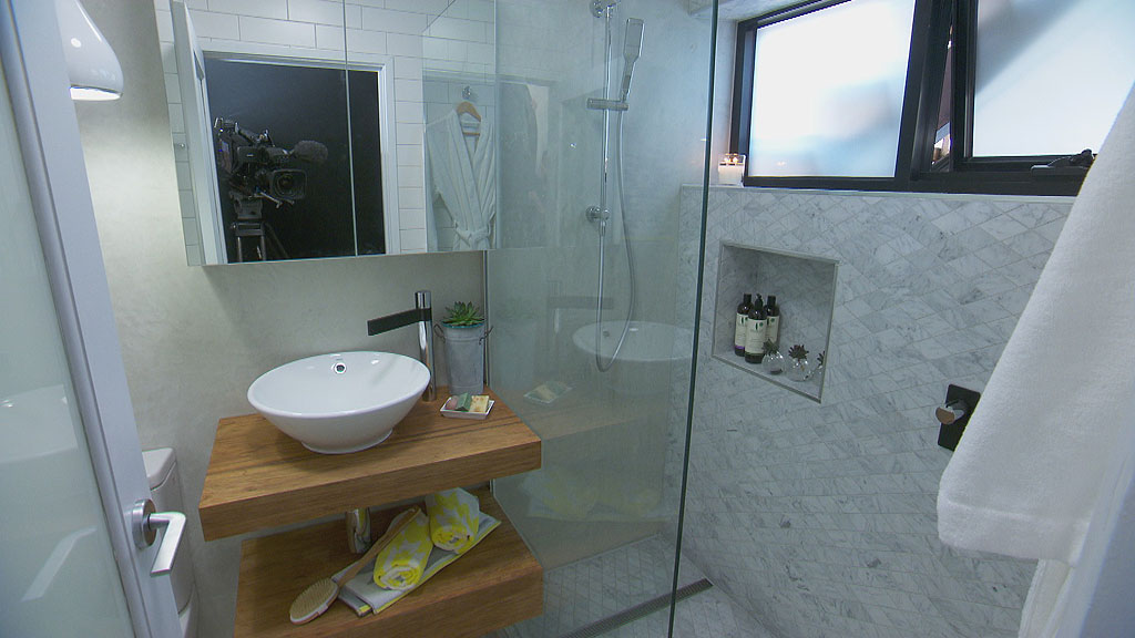
Tim and Anastasia
Space saver: Niches
I had little interest in this couple until they pulled off this bathroom! What a clever use of niches! A common favourite these days is having a shower niche. A little in-built , tiled shelf to house all your shampoos and soaps and whatnots. What made this special was the extra depth they created by building the wall out from the window and then also having extra space at the window height. Brilliant. nice and deep. Shallow ones just allow room for little bottles and we all know they tend to slide off occasionally.
Pulling it together
Although this bathroom does not match the rest of the apartment (taking a hint from Josh and Charlotte’s style perhaps?) it’s well laid out. Under the basin, not only is there a counter top for some small items, a shelf below that allows for some more. Plus, they managed to fit in a wider mirror cabinet. Is that pendant light hanging really low? It looks like it’s sitting at 1500mm from the floor! That’s shorter than me! I didn’t hear the judges say anything about that. However, the rest of the bathroom is great. I’m not too keen on the long white ceramic tile next to the expensive marble. Suddenly the bathroom became cheap.
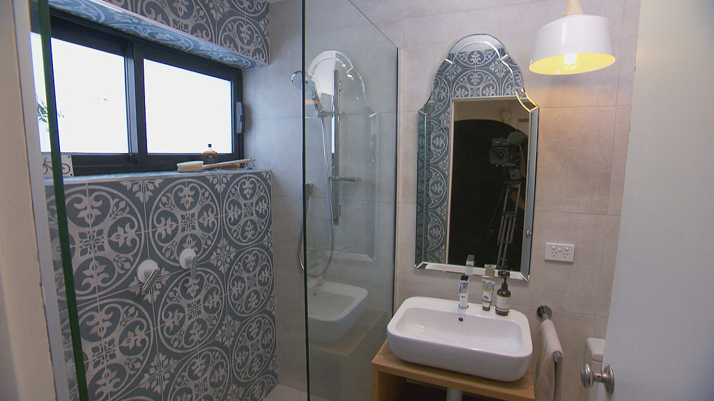
Jess and Ayden
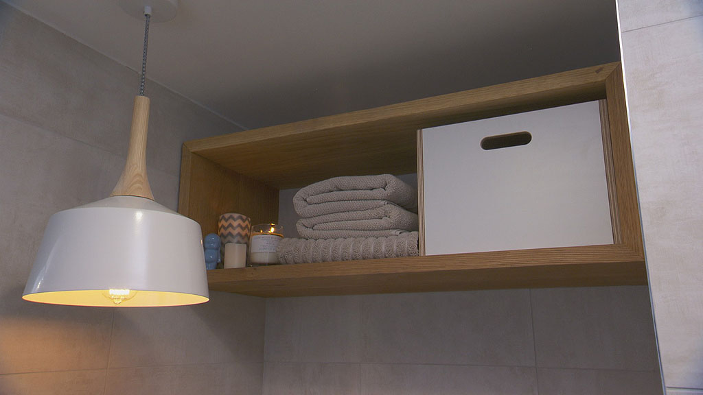
Space Saver: Storage box / shadow box /wall shelf
This bathroom looks great, even thought those tiles are a bit overwhelming, all the elements work pretty well together. The best idea from this couple was using a custom storage box shelf thingy, except the execution was a little off. They placed a box storage solution high above the toilet. You can see that it’s hard to reach and also, there isn’t any other storage apart from under the counter top and in the shower.
The box shelf would have been more useful directly above the toilet, long and elongated stretching towards the ceiling from the top of the cistern. Great idea, just in the wrong place.
Pulling it together
A nice soft palette of stone, timber, white and the blue/grey feature tile. Nothing is dramatically out of place. They chose a feature mirror instead of a cabinet mirror. Looks great, but no points here for lack of storage. Pendant light is probably too big also but it’s a nice fresh modern look overall.
Luke and Ebony
Space Saver : A full vanity with a door (albeit a small one)
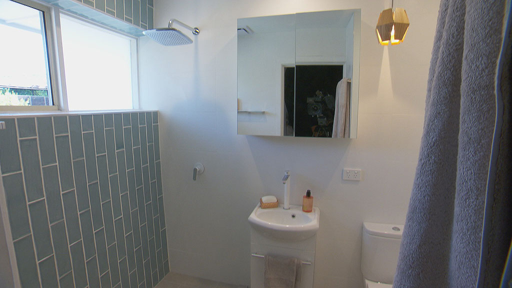
What a blow! The most colourful couple are out! I’m devastated! Nothing seemed to be on track with the bathroom which left a lot of things going wrong and not being installed. The best thing the couple did was to use a vanity with a door. The one they substituted is ugly but you still get to hide away your stuff from view. The original one they picked I think was a draw unit perhaps? These bathrooms are tiny and you need all the hideaway storage possible.
Pulling it together
Hmm, it would have been nice to see the tap on the real vanity. So, we’ll never know if the high tap was a good choice or not. See how the power point sticks out like a sore thumb? The pendant size here is appropriate though. Nice and small. The coloured tiles are on trend too with the ‘brickwork pattern’. They are similar to coloured glazed and also coloured glass subway tiles. (subway tiles are commonly 100x200mm and have a bevelled edge- industrial style tiles are around 100×300-400mm and are flat, like these ones). I agree that the white bathroom walls could have been painted to match the colourful bedroom and living but all it not lost. It’s a shame they were unable to finish it. It’s sad to see them go.
That’s my wrap up for the final elimination room reveals. Now it’s Block time. Super excited.
All photo’s care of Jump IN channel 9. See more pictures here.

