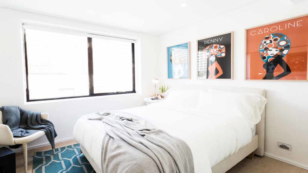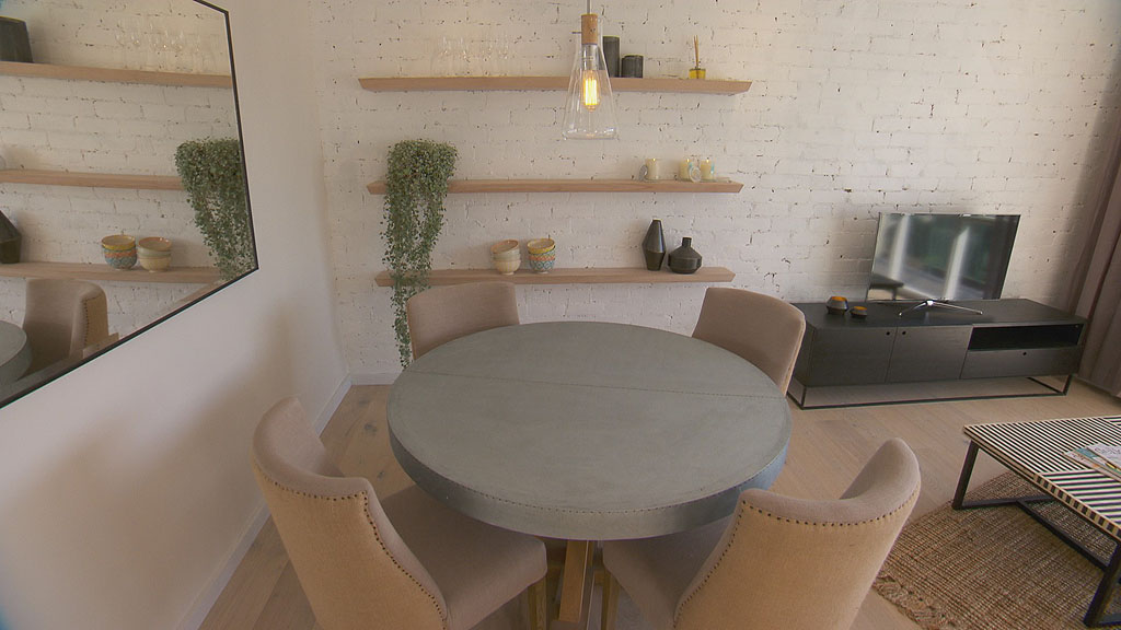
Everyone has an opinion on the room reveals on The Block but trying to fix a mistake is a bit harder to chew on. So, I’ve decided I would give it a go and try to add, replace or change some items in Josh and Charlotte’s room to make it better. This room does not reflect the style they were creating and it doesn’t keep with the rest of the apartment. This room completely clashes. Keeping in with their current elements from previous rooms, I took my inspiration mainly from their living room. I’m keeping the bed and the chair. (The bed depicted in my scheme is the closest I could find at short notice but it’s the same colour.)

What I changed
I selected a new side table which reflects the same clean lines as the mirror in the bedroom and also matches the furniture in the living room. A simple brass planter sits atop to add a bit of luxe. New twin artwork replaces the bright retro prints and colours are played out from this onto the cushions and the new rug. The table lamp has been dumped and replaced with a Nordic style timber pendant and a new throw ties in with the upholstered linen bed and light timber floorboards.
What do you think? Did I fix it? What would you change?


