Jess and Ayden
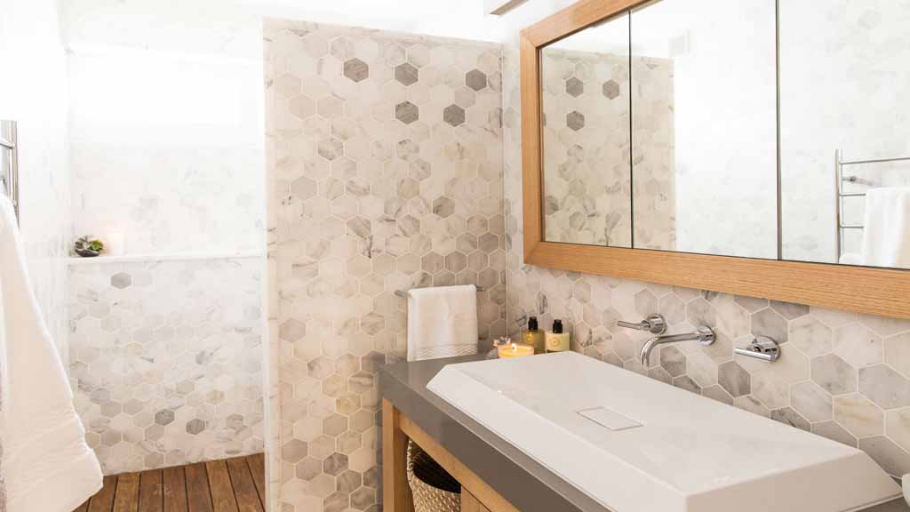
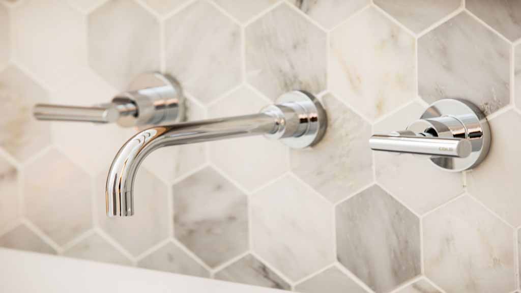
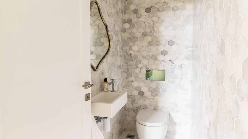
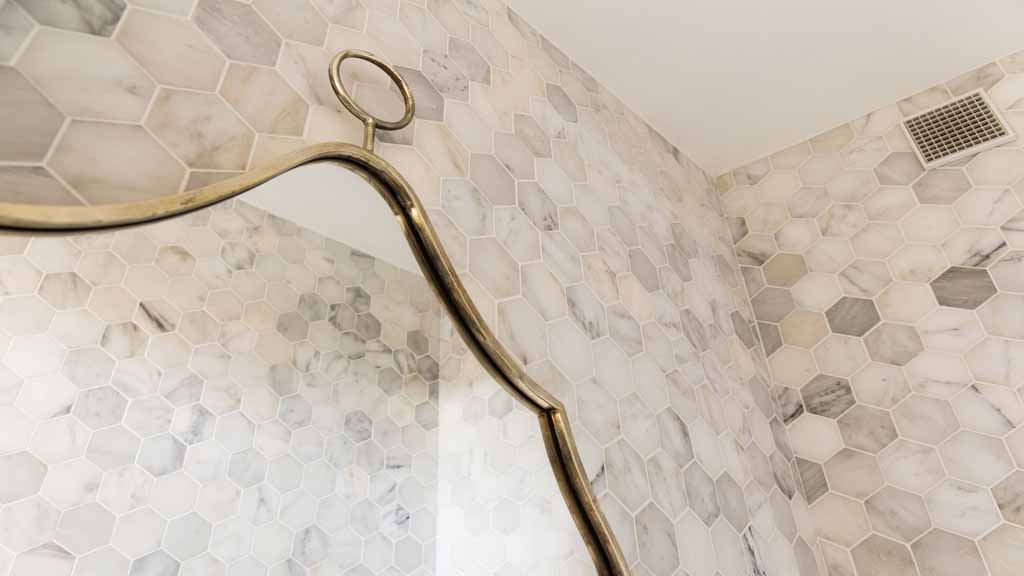
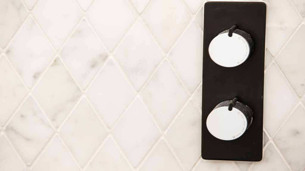
I love this marble hexagon tile but I just couldn’t justify spending $18K on it and the judges thoughts were that it was all just too much of a good thing! I agree. It’s way too much to spend on this calibre of apartment. A bit of over capitalising, if you will. The basin is a bit too impractical. It’s too wide and lessens the bench space. I would have chosen a smaller one. The marble half wall separating the shower blocks a lot of light coming from the window. A glass screen would have made more sense. I don’t mind the light timber with the marble, I see no problem with that. The chrome tapware co-ordinates with the light grey of the marble well and I like it’s simple stream line design.
Best style picks
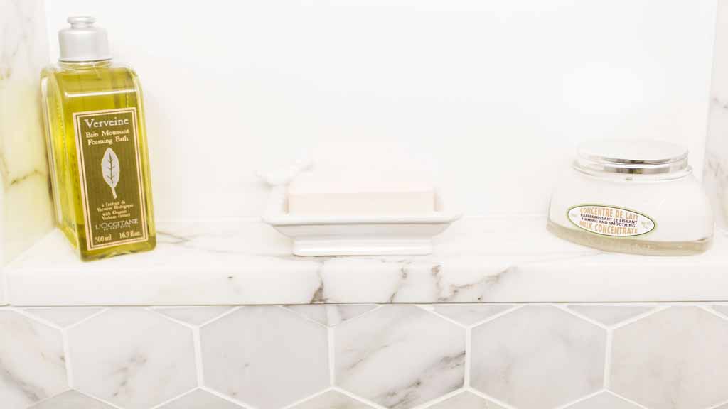
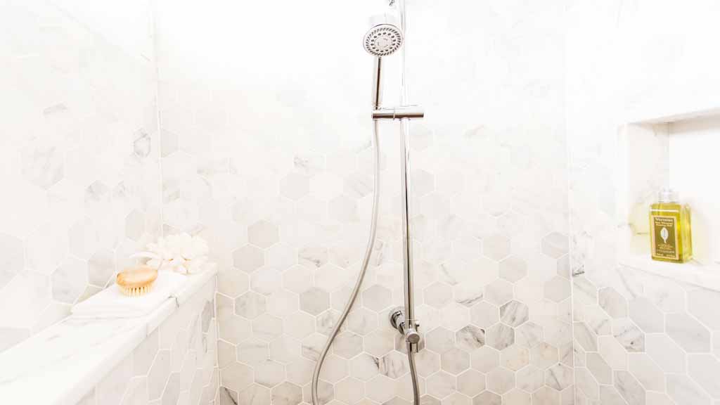
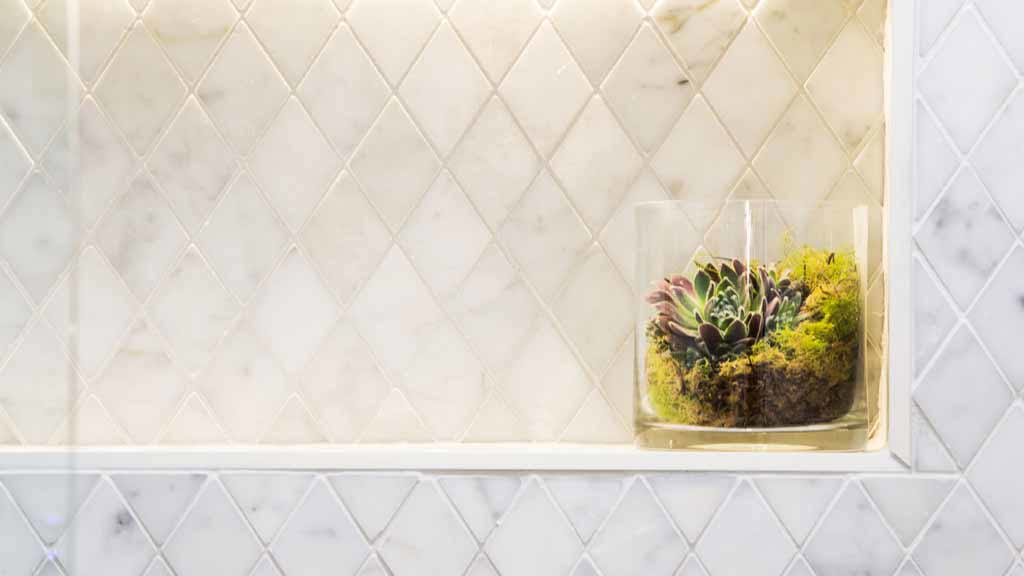
Using the marble slabs for the shower shelf and niches instead of continuing with the hexagon tile. That is a clever design idea. It finishes off the tile ends nicely so you don’t have to look at tile edges.
Special mention to the mirror in the toilet. A beautiful antique silver (I think) finish frame. Very nice with the marble.
Josh and Charlotte
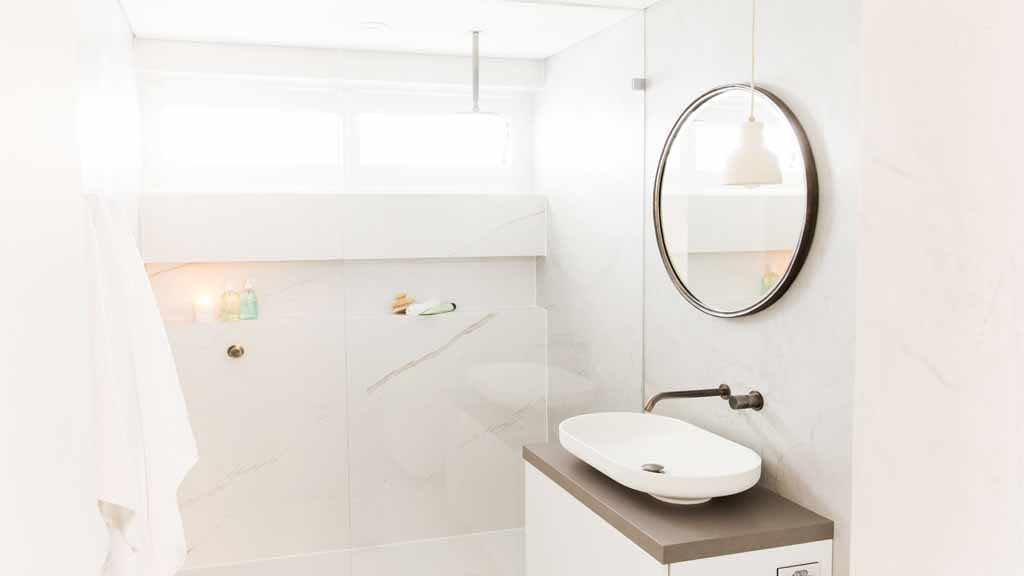
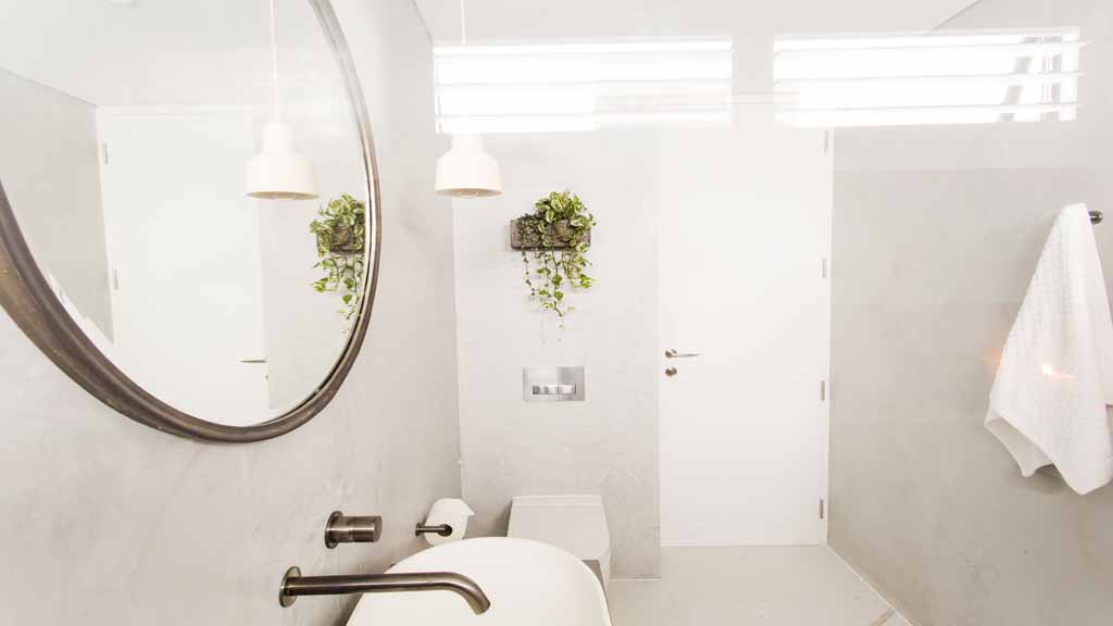
I think this bathroom was a little over looked. It is quite simple in it’s design but still very beautiful. It sure did lack storage but the elements including the colour pallette was a neutral knock out. I think it matches the rest of their apartment well.
Best Style Picks
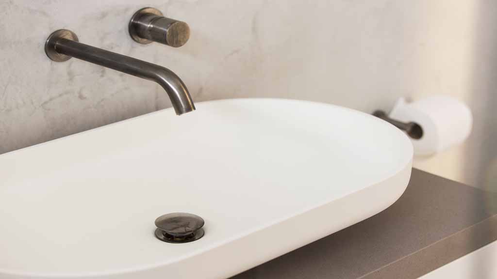
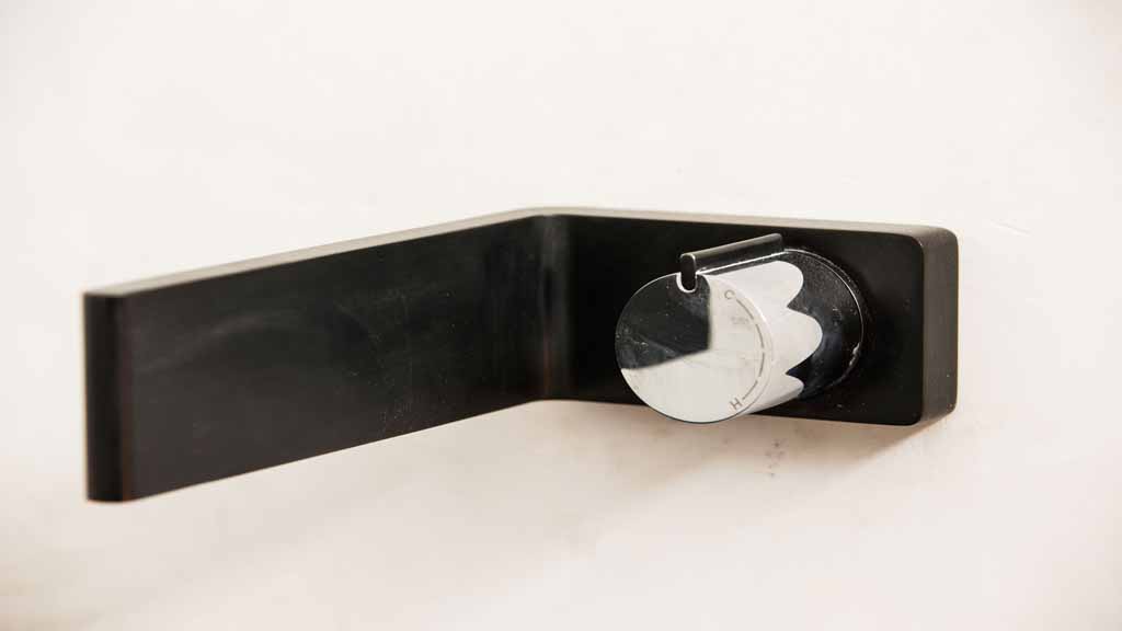
Having an upgraded slim line power point set into the vanity side. A great way to not make them a feature on a beautifully tiled wall. The brushed, antiqued tapware matched with the mirror is a great design feature. It adds something a little different instead of the standard chrome.
Tim and Anastasia
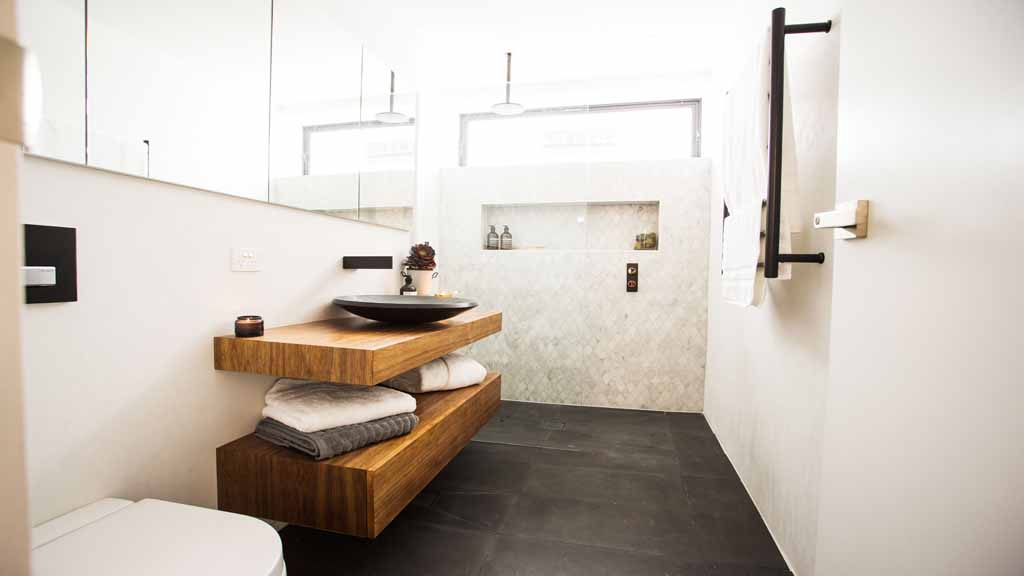
Okay, this couple is fast becoming my favourite because of their new found style. They have ticked all the boxes here with storage, a mixture of textures and all with a great floor plan. This was my pick to win. I couldn’t find a fault.
Best Style Picks
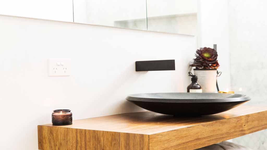
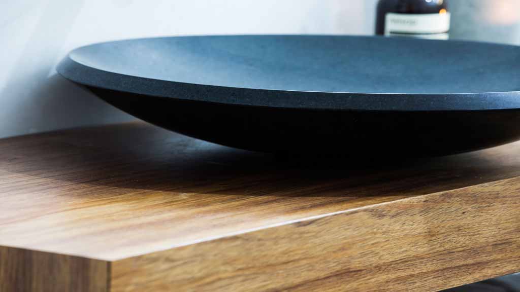
Changing it up! Dark floor with marble featured at one end with highlights (technically they’re called lowlights!) of black tapware! The vanity with it’s two shelf design is great for housing most of the larger items plus enables a place to stack your towels. It also acts a visual contrast and helps break up the whites in the room and brings an element of earth and warmth. Another in-built and very wide mirror cabinet is devine. I thought it was a shoe-in to win!
Dee and Daz
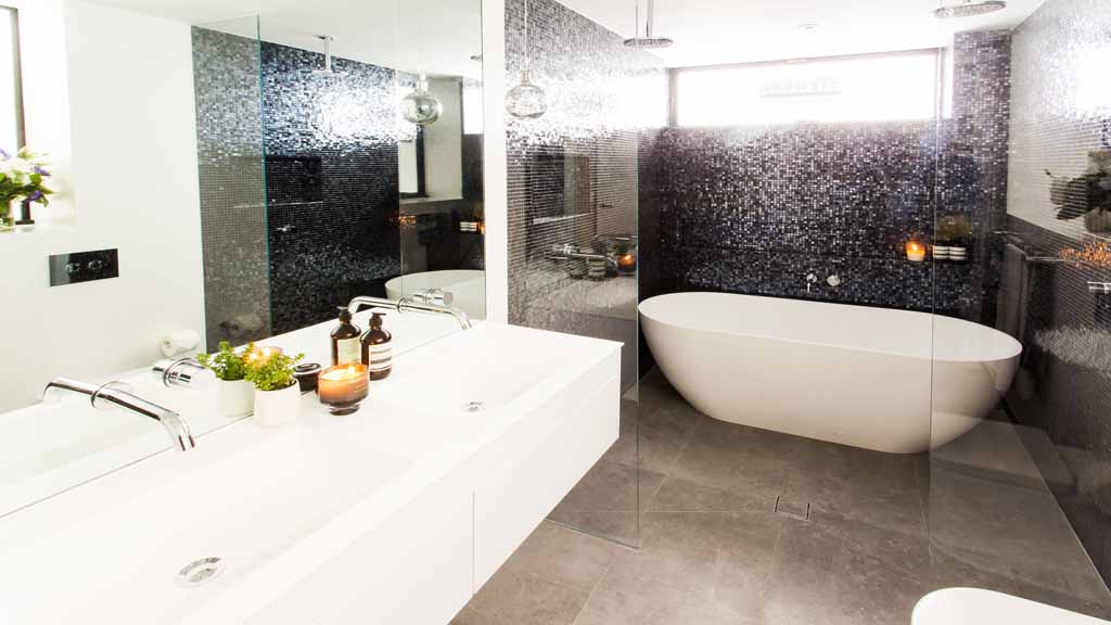
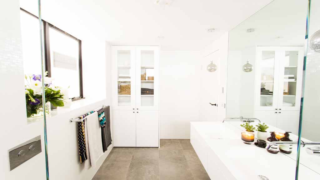
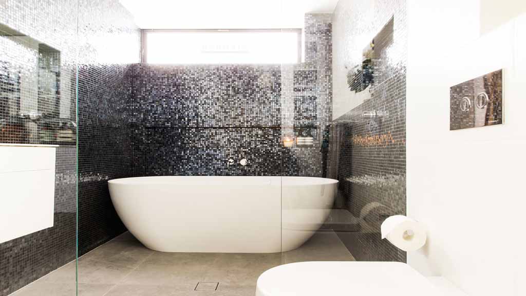
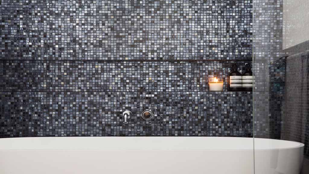
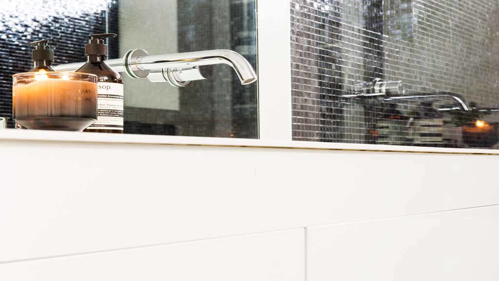
This was the largest bathroom and the only one with a bath. The double vanity with the all in one ceramic sink is something you’ll see everywhere but I’ve never been a fan because the basins are too large and there’s no bench space to put stuff. I’m not usually a fan of glossy mosaic tiles and this doesn’t really tickle my fancy but I can understand why others
may like it. I love the double shower head but I agree with Ms Blaze that you’ll be forever mopping up water due to the screens being only 500mm wide. Not nearly enough to cover splashes! Overall though, it feels very open and spacious with a well thought out floor plan.
Best Style Picks
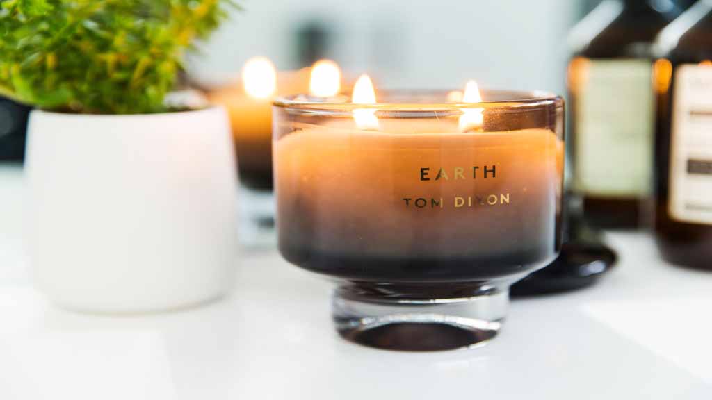
If you find you don’t have enough storage in a vanity for the price you want, it’s often cheaper and easier to accommodate a full height storage cabinet. Did you realise those Tom Dixon candles are $109 each!
