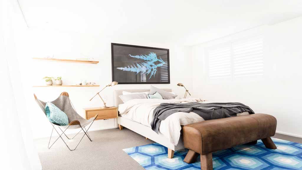
Josh and Charlotte have gone full circle and are now building on the style elements of their first room and their lounge/dining area. Thank goodness! A lot of people liked their individual slightly Scandi style. Here is how it worked this week
Josh and Charlotte
Style: Relaxed
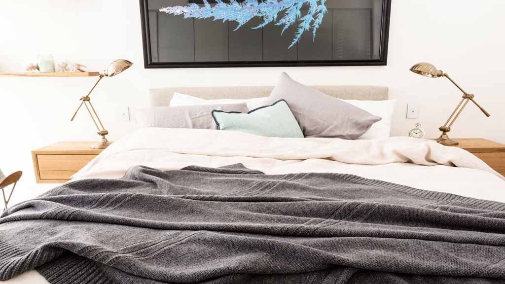
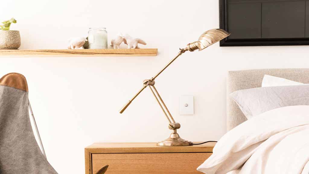
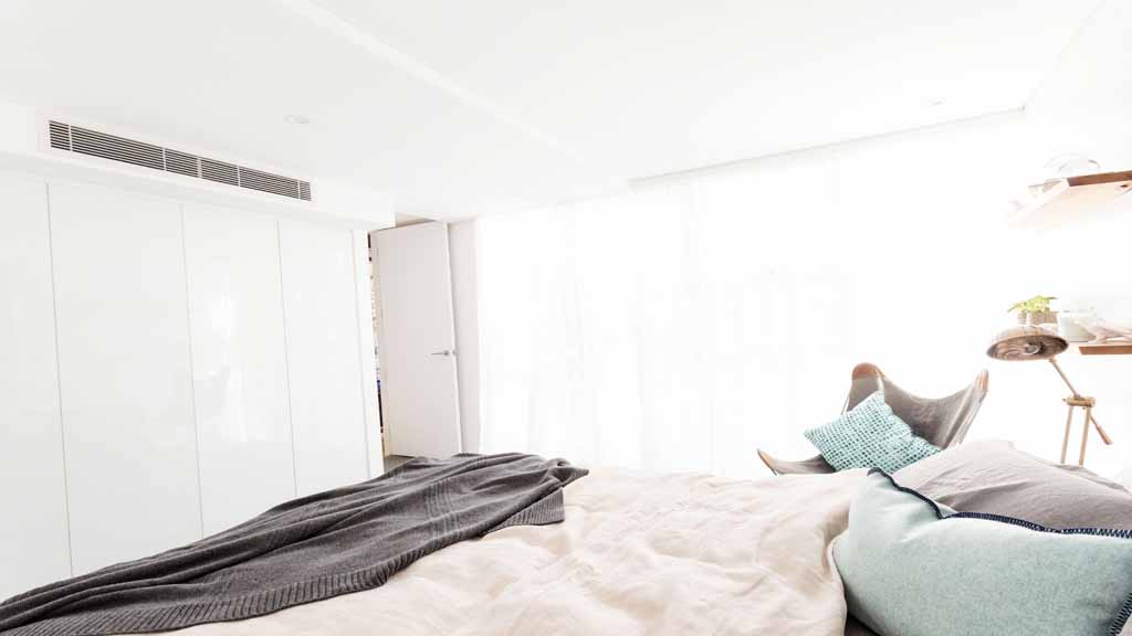
They created a very relaxed bedroom with a neutral background and pops of blue. I, for one, don’t like the rug here. I think it’s too retro patterned for their style. However, the room is so relaxed that even the bed linen and styled casually. It’s a very simple light colour scheme and a little bit of timber goes a long way with light schemes. You can see how the cameraman had difficulty photographing with such a white background. The edges of the room including the window are completely scrubbed out! I would have preferred something on the walls (to create little more depth or interest).
This is what happens when we change it to black and white to look for the tones.
See how those white walls become really stark and cold? The carpet is not much darker and this makes it feel a little weird right? Considering the darkest tone is probably a 9 out of 10 (10 be the darkest and 1 the lightest) and it’s used in the picture frame and no where else. This is a little unbalanced tone wise.
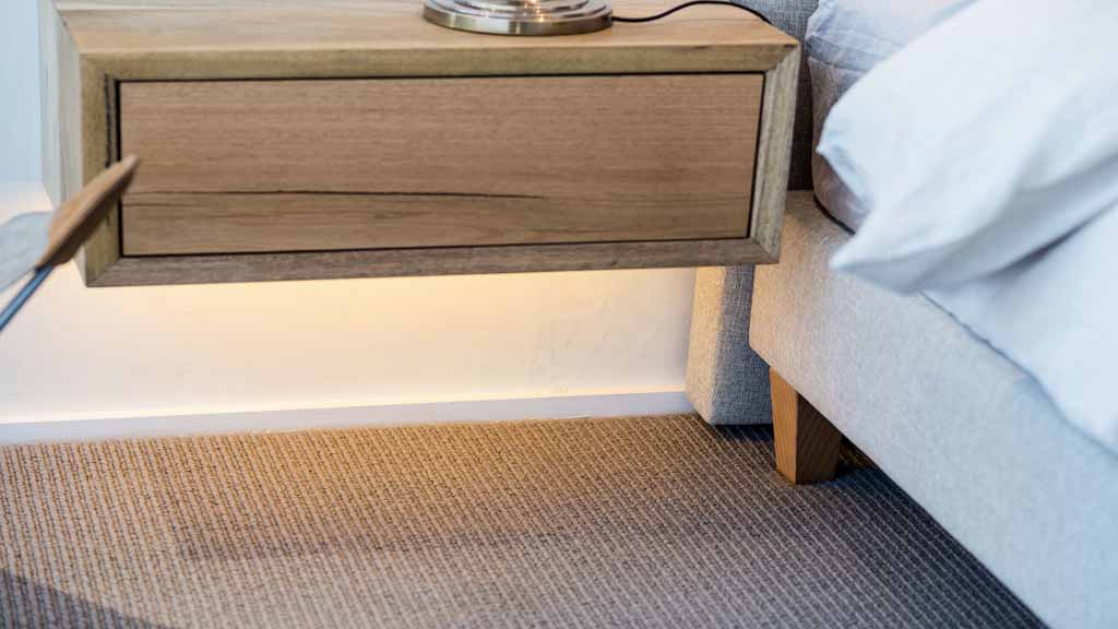
A special mention to the continuation of the under cabinet lighting. You can get sensors these days for night time toilet trips!
Here is the basic colour scheme.
